Here’s a really interesting historical interview on the topic of newspaper syndicated comics from an insider’s perspective. From Peanuts to Lil’ Abner, Family Circus and Prince Valiant, this was the golden age of newspaper comics. Jud Hurd (1913 – September
Read More
Tag: Peanuts
Read this new post ! ~ (subscribers)
ICECUBES TV ~ New Podcast 10/27/2016
New ICECUBES podcast about where to get cheap art supplies! 🙂
Charles ‘Sparky’ Schulz & Russel Harvey.
A few years back I had the pleasure of meeting Russel Harvey, scion of Harvey Comics, at MoCCA in New York City.(You can read about our encounter here.) Since then, we have managed to stay in touch digitally and Russel
Read More
Practice with Peanuts.
Just for fun! 🙂 Good practice. Schulz developed a fast stroke that is hard to replicate without lots of practice. For him over time, drawing Peanuts became like writing shorthand.
Color matters! Peanuts vs. McDonalds.
It used to be that comics had really great colors. Big primary colors printed with halftone dots. A lot of the times the color dots were off register and would bleed outside the lines. That was so cool! In fact
Read More
Good company.
In this picture ICECUBES is definitely in good company! Although the comparison is clearly unfair… for them. 🙂 I just thought it was interesting to see how the first ICECUBES book was published compared to their first books. Lucky you,
Read More
Backdrawing.
When drawing on the outer edge of your panel, it’s important to extend the drawing as if you were drawing the whole character. Even if parts will get cut off it is a good idea to draw them to get
Read More
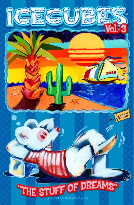
New ICECUBES Book Vol. 3!
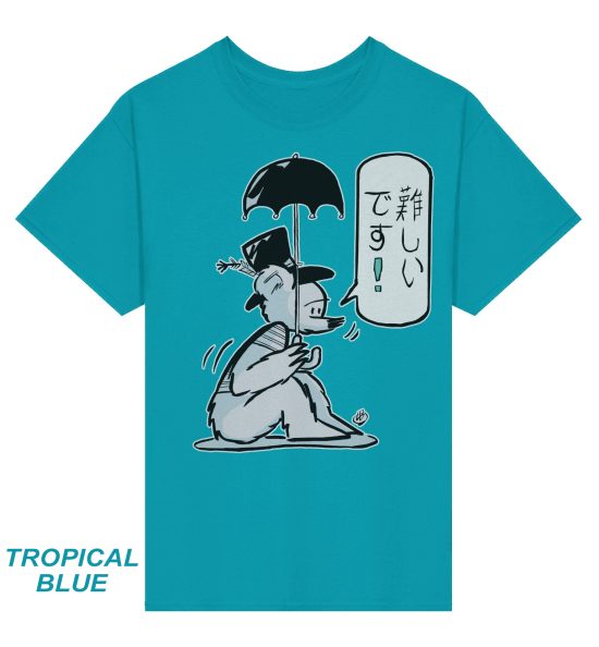
New ICECUBES T-Shirt! *** 12 awesome colors!
Latest ICECUBES Comics!
-
1
ICECUBES the Comic Strip #369
4 825 Apr 09, 2026
-
2

ICECUBES Vol.3 “The Stuff of Dreams!” Now Available!
198 34234 Dec 13, 2025
-
3

The New Book is Here!! ICECUBES Vol. 3!
0 0 Dec 12, 2025
-
4

ICECUBES the Comic Strip #368
52 29042 Nov 03, 2025
-
5

ICECUBES in Japanese!
24 32735 Oct 06, 2025
-
6

ICECUBES the Comic Strip #367
46 34258 Sep 07, 2025
-
7

ICECUBES the Comic Strip #366
15 26595 Aug 14, 2025
-
8

ICECUBES the Comic Strip #365
5 15936 Jul 31, 2025
-
9

ICECUBES the Comic Strip #364
11 14288 Jul 18, 2025
-
10

ICECUBES the Comic Strip #362
9 11235 Jul 11, 2025
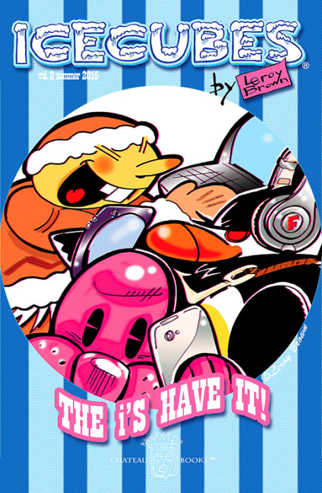
ICECUBES vol.2 comic book now available as a digital download for only $1.99! Click on the picture!
Books

Click here to get all the great classic ICECUBES comic strips and exclusive behind the scenes blog posts!
Top Ten ICECUBES comics!
-
1

ICECUBES the comic strip #359
98 87042 Jul 05, 2024
-
2

ICECUBES the Comic Strip #363
88 68488 Apr 24, 2025
-
3

ICECUBES the comic strip #360
83 53865 Oct 18, 2024
-
4

Sad…
53 36440 Feb 12, 2025
-
5

ICECUBES the Comic Strip #367
46 34258 Sep 07, 2025
-
6

ICECUBES Vol.3 “The Stuff of Dreams!” Now Available!
198 34234 Dec 13, 2025
-
7

ICECUBES in Japanese!
24 32735 Oct 06, 2025
-
8
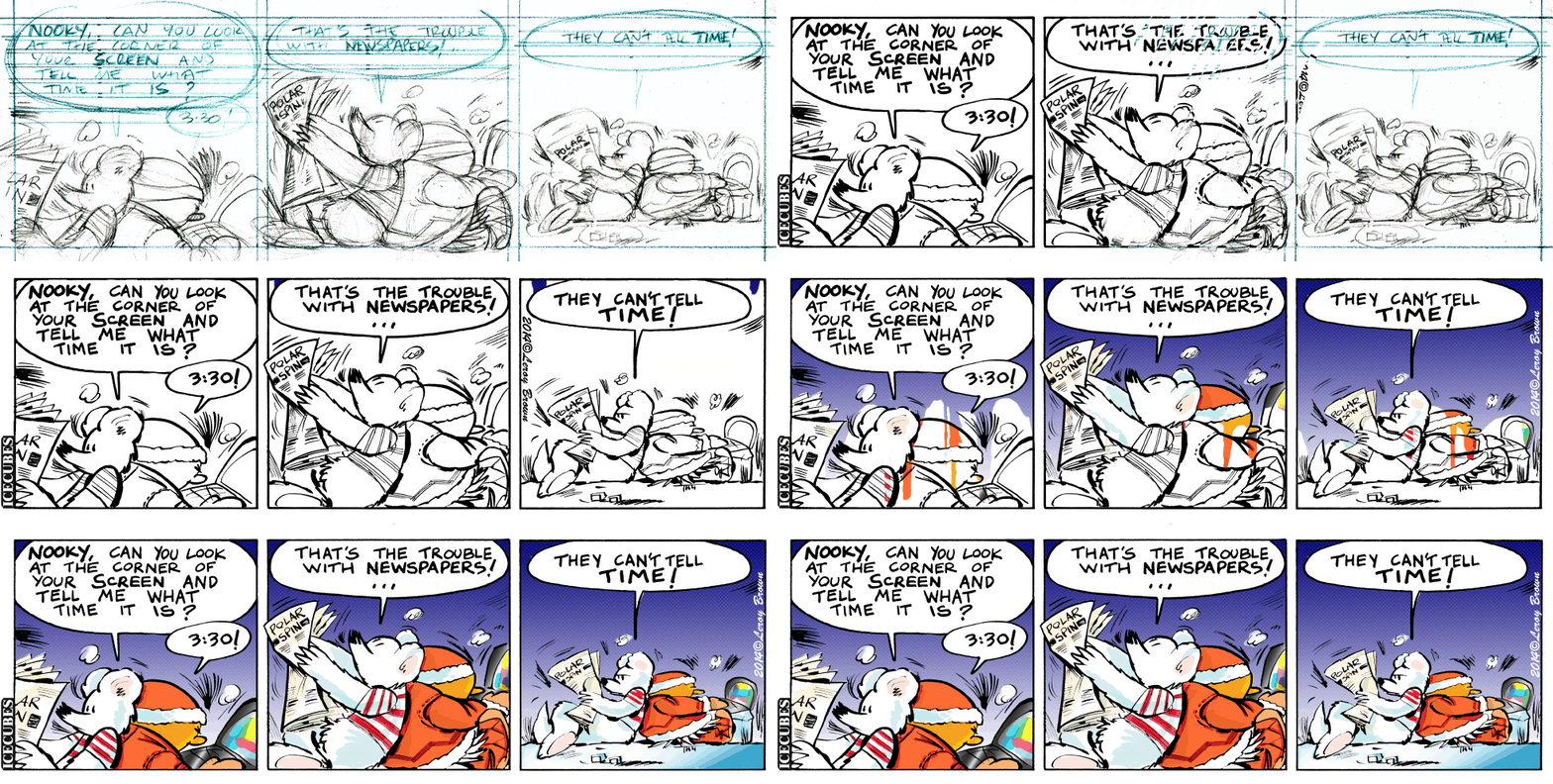
ICECUBES the comic strip #0236 Animated!
86 30852 Mar 10, 2014
-
9

ICECUBES the Comic Strip #368
52 29042 Nov 03, 2025
-
10
ICECUBES the comic strip #353
69 27434 Mar 29, 2024
Search by Character:
Boo-Boo Boomer Bear Buckaroo Bonanza Eggman Felix Freeze Kiviuk Mickey Nooky Peckinpaw Percy Popeye Susie Taco Tlaco MitzliChoose your chapter to start reading:

ICEBOX Blog Tags:
Comics Tags:
Animated Anime Books Cartoons Christmas Classic Comic Strips Easter Eggman Felix Freeze Halloween Happy New Year! ICECUBES Japan Kawaii Manga Marvel Mickey Mouse Movies Nooky Original art Peckinpaw Percy Pogo Spiderman Subscribers Summer Taco ThanksgivingCategories
Alaska time
| Friday | +64° | +38° | |
| Saturday | +61° | +55° | |
| Sunday | +58° | +45° | |
| Monday | +44° | +37° | |
| Tuesday | +40° | +34° | |
| Wednesday | +41° | +35° |
Archives
- December 2025 (1)
- November 2025 (1)
- October 2025 (2)
- August 2025 (3)
- July 2025 (2)
- June 2025 (1)
- April 2025 (1)
- February 2025 (1)
- December 2024 (1)
- July 2024 (1)
- June 2024 (1)
- May 2024 (3)
- April 2024 (4)
- March 2024 (5)
- February 2024 (2)
- December 2023 (2)
- November 2023 (1)
- October 2023 (5)
- September 2023 (4)
- August 2023 (1)
- May 2023 (4)
- April 2023 (1)
- February 2023 (1)
- January 2023 (1)
- November 2022 (1)
- October 2022 (1)
- April 2022 (2)
- March 2022 (2)
- February 2022 (2)
- January 2022 (1)
- December 2021 (1)
- March 2018 (1)
- May 2017 (3)
- March 2017 (1)
- December 2016 (2)
- October 2016 (3)
- August 2016 (1)
- June 2016 (1)
- May 2016 (1)
- January 2016 (1)
- November 2015 (2)
- September 2015 (3)
- August 2015 (1)
- July 2015 (2)
- June 2015 (4)
- May 2015 (3)
- April 2015 (3)
- March 2015 (1)
- February 2015 (1)
- January 2015 (4)
- December 2014 (4)
- October 2014 (1)
- September 2014 (1)
- July 2014 (2)
- June 2014 (1)
- May 2014 (7)
- April 2014 (5)
- March 2014 (10)
- February 2014 (9)
- January 2014 (7)
- December 2013 (4)
- October 2013 (2)
- September 2013 (3)
- August 2013 (3)
- July 2013 (3)
- March 2013 (2)
- January 2013 (4)
- December 2012 (3)
- November 2012 (2)
- October 2012 (3)
- September 2012 (2)
- August 2012 (7)
- June 2012 (1)
- May 2012 (5)
- April 2012 (10)
- March 2012 (3)
- February 2012 (1)
- January 2012 (8)
- December 2011 (9)
- November 2011 (5)
- October 2011 (5)
- September 2011 (7)
- August 2011 (6)
- July 2011 (5)
- June 2011 (12)
- May 2011 (17)
- April 2011 (13)
- March 2011 (7)
- January 2011 (4)
- December 2010 (2)
- June 2010 (3)
- May 2010 (10)
- April 2010 (9)
- March 2010 (2)
- February 2010 (2)
- January 2010 (5)
- October 2009 (6)
- July 2009 (1)
- June 2009 (2)
- May 2009 (2)
- April 2009 (3)
- March 2009 (5)
- February 2009 (3)
Search ICECUBES
Online Fans
No one is online right now


Recent Comments