***Merry Christmas and a Happy New Year!***
Merry Christmas from ICECUBES!

***Merry Christmas and a Happy New Year!***
1 2640

Merry Christmas and a Happy New Year!

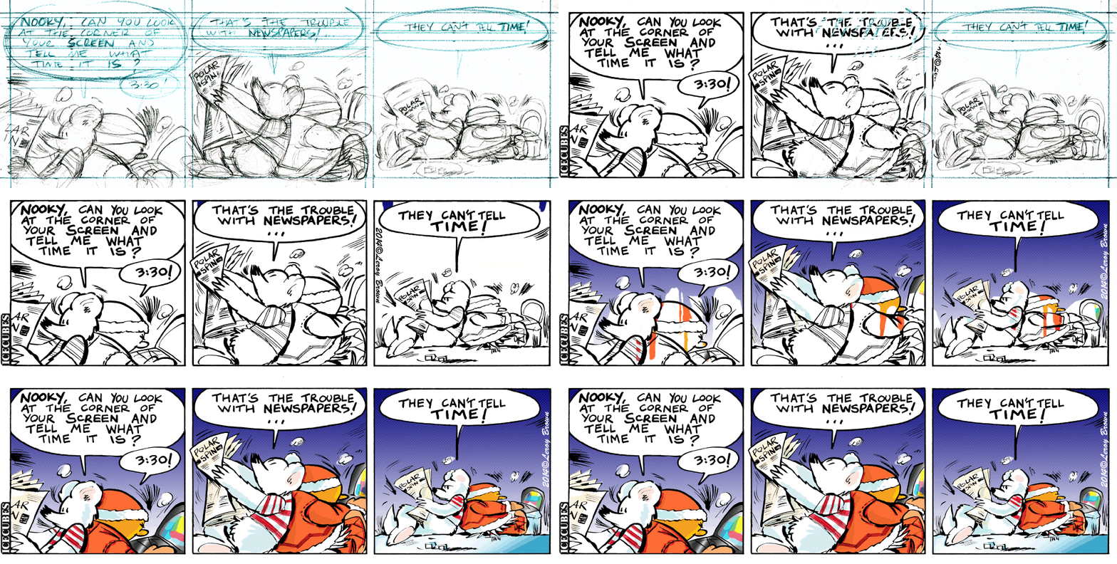
ICECUBES Christmas Original Art Dear Wonderful ICECUBES Fans! I decided to create a special Christmas Comic Strip since it's been such an unusual year. I just wanted to thank you all for the support and love you have shown towards ICECUBES for so long. In celebration of the season I have also decided to sell the original art for this comic. It is drawn, inked and painted by hand on a 11"x17" Canson Fan Boy blueline comic page. India ink and watercolors were used. Bluelines are showing on the original art as well as some cut and pasted paper. The lettering is also hand drawn. The price is $100 (+ shipping) and I will donate 50% of the proceeds to St. Jude Children's Research Hospital. I will autograph the page and make it out to whomever you designate. Thank you again so much for being great fans and hopefully we'll see more of the ICECUBES 'cool crew' in 2022!
Signature made out to:

One thought on “Merry Christmas and a Happy New Year!”

  1. Happy New Year everyone! πŸ™‚

Leave a Reply

Your email address will not be published. Required fields are marked *

*

This site uses Akismet to reduce spam. Learn how your comment data is processed.

Color matters! Peanuts vs. McDonalds.

comparison It used to be that comics had really great colors. Big primary colors printed with halftone dots. A lot of the times the color dots were off register and would bleed outside the lines. That was so cool! In fact my wife and I agree that it made the comic better when the color was off register like that! Nowadays I’ve noticed that colors are no longer printed that way. In fact colors lay real flat on the page now and seem to look dull in some cases. For instance this Peanuts Sunday cartoon just looks flat and lifeless.© Universal Press The colors are drab and dull. Its quite upsetting actually to see a once great comic strip like Peanuts reduced to looking second rate. Whoever colored this did an awful job. But that’s not the only problem. The colors are extremely flat and are perfectly within the lines, how deadening is that? Sometimes too much technology just kills something great. I did find something cool though. It seems that McDonalds still uses the old halftone print jobs on their Happy Meal bags! I think they look great by the way and so much more dynamic than that poor Peanuts strip. Good job McDonalds, I hope they keep it up! © Mc Donalds I would love to print an ICECUBES comic book this way! πŸ™‚ © Mc Donalds