Well folks, the end of the year is fast approaching and Peckinpaw has a funny feeling. Do you have a funny feeling? Let me know in the comments down below. Thanks for reading ICECUBES! Remember the original art for this strip is available for purchase at the ICECUBES Shop!
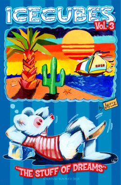
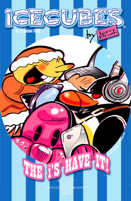
coming soon!ICECUBES the comic strip Volume 2 on the Kindle is coming out real soon! Watch for the announcement on Facebook and Twitter! Get it first and show off to your friends! More than 60 pages of comics and art from your pals at ICECUBES.
This will be the one everyone will want, so be on the lookout for ICECUBES the comic strip Volume 2 !
It used to be that comics had really great colors. Big primary colors printed with halftone dots. A lot of the times the color dots were off register and would bleed outside the lines. That was so cool! In fact my wife and I agree that it made the comic better when the color was off register like that!
Nowadays I’ve noticed that colors are no longer printed that way. In fact colors lay real flat on the page now and seem to look dull in some cases. For instance this Peanuts Sunday cartoon just looks flat and lifeless.The colors are drab and dull. Its quite upsetting actually to see a once great comic strip like Peanuts reduced to looking second rate. Whoever colored this did an awful job. But that’s not the only problem. The colors are extremely flat and are perfectly within the lines, how deadening is that? Sometimes too much technology just kills something great.
I did find something cool though. It seems that McDonalds still uses the old halftone print jobs on their Happy Meal bags! I think they look great by the way and so much more dynamic than that poor Peanuts strip. Good job McDonalds, I hope they keep it up! I would love to print an ICECUBES comic book this way! 🙂


 I’m putting the finishing touches on the cover. The countdown is on! Be sure to catch ICECUBES the comic strip Volume 2 as soon as it comes out!!
 see the published strip here


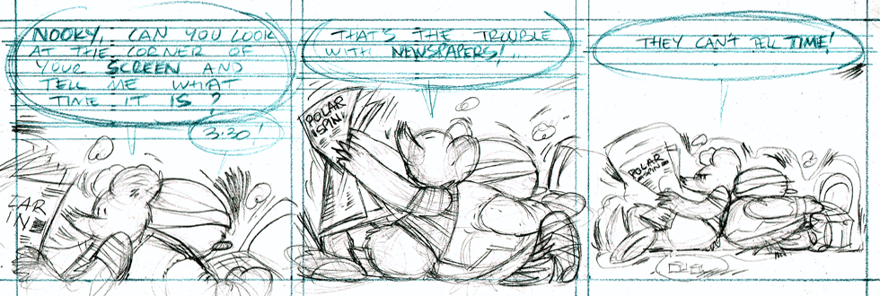
 Preliminary pencil sketch for the cover of Vol. 2 on the Kindle. It’s coming real soon! 🙂
 It used to be that comics had really great colors. Big primary colors printed with halftone dots. A lot of the times the color dots were off register and would bleed outside the lines. That was so cool! In fact my wife and I agree that it made the comic better when the color was off register like that!
Nowadays I’ve noticed that colors are no longer printed that way. In fact colors lay real flat on the page now and seem to look dull in some cases. For instance this Peanuts Sunday cartoon just looks flat and lifeless.
It used to be that comics had really great colors. Big primary colors printed with halftone dots. A lot of the times the color dots were off register and would bleed outside the lines. That was so cool! In fact my wife and I agree that it made the comic better when the color was off register like that!
Nowadays I’ve noticed that colors are no longer printed that way. In fact colors lay real flat on the page now and seem to look dull in some cases. For instance this Peanuts Sunday cartoon just looks flat and lifeless. The colors are drab and dull. Its quite upsetting actually to see a once great comic strip like Peanuts reduced to looking second rate. Whoever colored this did an awful job. But that’s not the only problem. The colors are extremely flat and are perfectly within the lines, how deadening is that? Sometimes too much technology just kills something great.
I did find something cool though. It seems that McDonalds still uses the old halftone print jobs on their Happy Meal bags! I think they look great by the way and so much more dynamic than that poor Peanuts strip. Good job McDonalds, I hope they keep it up!
The colors are drab and dull. Its quite upsetting actually to see a once great comic strip like Peanuts reduced to looking second rate. Whoever colored this did an awful job. But that’s not the only problem. The colors are extremely flat and are perfectly within the lines, how deadening is that? Sometimes too much technology just kills something great.
I did find something cool though. It seems that McDonalds still uses the old halftone print jobs on their Happy Meal bags! I think they look great by the way and so much more dynamic than that poor Peanuts strip. Good job McDonalds, I hope they keep it up!  I would love to print an ICECUBES comic book this way! 🙂

 Funny Mexican Popsicle wrapper.


One thought on “ICECUBES the comic strip #361”
Leroy Brown
Looking forward to the new year? Let me know if you guys would like to see a new ICECUBES book for 2025.