The website was down all day yesterday because of a problem with the hosting company. I was on the road and unable to fix the problem until later last nite. Sorry for the delay and thanks for checking back in. Remember to click on the ads! Thanks!
Good Morning Sir: I stumbled across your Leroy Brown/Jim Croce work and was impressed. Great Job. Can you do other animations? I wrote a book several years back that was taken from a record I really enjoyed listening to. I was wondering could you do similar work and what are your cost for a three minute session. Peace
Oh wow, that’s really cool! Of course, I did not do the Jim Croce cartoon. That was done way back in 1973 by a man named John Wilson for the Sonny & Cher Show. To do a 3 min. animation like that today would probably cost thousands of dollars. If you would like to see a cartoon I did, go to this link: https://youtu.be/kv1S9MIhqzE?si=ybNZ9cyfQeaoVMab
coming soon!ICECUBES the comic strip Volume 2 on the Kindle is coming out real soon! Watch for the announcement on Facebook and Twitter! Get it first and show off to your friends! More than 60 pages of comics and art from your pals at ICECUBES.
This will be the one everyone will want, so be on the lookout for ICECUBES the comic strip Volume 2 !
It used to be that comics had really great colors. Big primary colors printed with halftone dots. A lot of the times the color dots were off register and would bleed outside the lines. That was so cool! In fact my wife and I agree that it made the comic better when the color was off register like that!
Nowadays I’ve noticed that colors are no longer printed that way. In fact colors lay real flat on the page now and seem to look dull in some cases. For instance this Peanuts Sunday cartoon just looks flat and lifeless.The colors are drab and dull. Its quite upsetting actually to see a once great comic strip like Peanuts reduced to looking second rate. Whoever colored this did an awful job. But that’s not the only problem. The colors are extremely flat and are perfectly within the lines, how deadening is that? Sometimes too much technology just kills something great.
I did find something cool though. It seems that McDonalds still uses the old halftone print jobs on their Happy Meal bags! I think they look great by the way and so much more dynamic than that poor Peanuts strip. Good job McDonalds, I hope they keep it up! I would love to print an ICECUBES comic book this way! 🙂


5 thoughts on “ICECUBES the comic strip #353”
Leroy Brown
The website was down all day yesterday because of a problem with the hosting company. I was on the road and unable to fix the problem until later last nite. Sorry for the delay and thanks for checking back in. Remember to click on the ads! Thanks!
Anonymous
I notice the site for your Ice Cubes webcomic. Do you think you can do other comic book work in the future like maybe Sonic the Hedgehog for IDW?
Leroy Brown
Hi! Sure, I could do work for other comic books if they asked me. Who knows, it could happen! 🙂 Thanks for reading ICECUBES.
Anonymous
Good Morning Sir: I stumbled across your Leroy Brown/Jim Croce work and was impressed. Great Job. Can you do other animations? I wrote a book several years back that was taken from a record I really enjoyed listening to. I was wondering could you do similar work and what are your cost for a three minute session. Peace
Leroy Brown
Oh wow, that’s really cool! Of course, I did not do the Jim Croce cartoon. That was done way back in 1973 by a man named John Wilson for the Sonny & Cher Show. To do a 3 min. animation like that today would probably cost thousands of dollars. If you would like to see a cartoon I did, go to this link: https://youtu.be/kv1S9MIhqzE?si=ybNZ9cyfQeaoVMab
Santa Says:
Winter Is Here! :)
ICECUBES Kindle Volume 2 Cover!
The Cover.
Ice Bag.
Pencil sketches.
Kindle Volume #2 Cover Art.
ICECUBES the comic strip. Kindle Vol. 2!
Color matters! Peanuts vs. McDonalds.
Icesticks.
Icesticks.
Icesticks.
New ICECUBES Book Vol. 3!
New ICECUBES T-Shirt! *** 12 awesome colors!
Latest ICECUBES Comics!
ICECUBES the Comic Strip #369
5 925 Apr 09, 2026
ICECUBES Vol.3 “The Stuff of Dreams!” Now Available!
198 34240 Dec 13, 2025
ICECUBES the Comic Strip #368
52 29050 Nov 03, 2025
ICECUBES in Japanese!
24 32743 Oct 06, 2025
ICECUBES the Comic Strip #367
46 34262 Sep 07, 2025
ICECUBES the Comic Strip #366
15 26598 Aug 14, 2025
ICECUBES the Comic Strip #365
5 15936 Jul 31, 2025
ICECUBES the Comic Strip #364
11 14290 Jul 18, 2025
ICECUBES the Comic Strip #362
9 11247 Jul 11, 2025
ICECUBES the Comic Strip #363
88 68490 Apr 24, 2025
ICECUBES vol.2 comic book now available as a digital download for only $1.99! Click on the picture!
Books
Click here to get all the great classic ICECUBES comic strips and exclusive behind the scenes blog posts!
Top Ten ICECUBES comics!
ICECUBES the comic strip #359
98 87044 Jul 05, 2024
ICECUBES the Comic Strip #363
88 68490 Apr 24, 2025
ICECUBES the comic strip #360
83 53867 Oct 18, 2024
Sad…
53 36444 Feb 12, 2025
ICECUBES the Comic Strip #367
46 34262 Sep 07, 2025
ICECUBES Vol.3 “The Stuff of Dreams!” Now Available!
198 34240 Dec 13, 2025
ICECUBES in Japanese!
24 32743 Oct 06, 2025
ICECUBES the comic strip #0236 Animated!
86 30868 Mar 10, 2014
ICECUBES the Comic Strip #368
52 29050 Nov 03, 2025
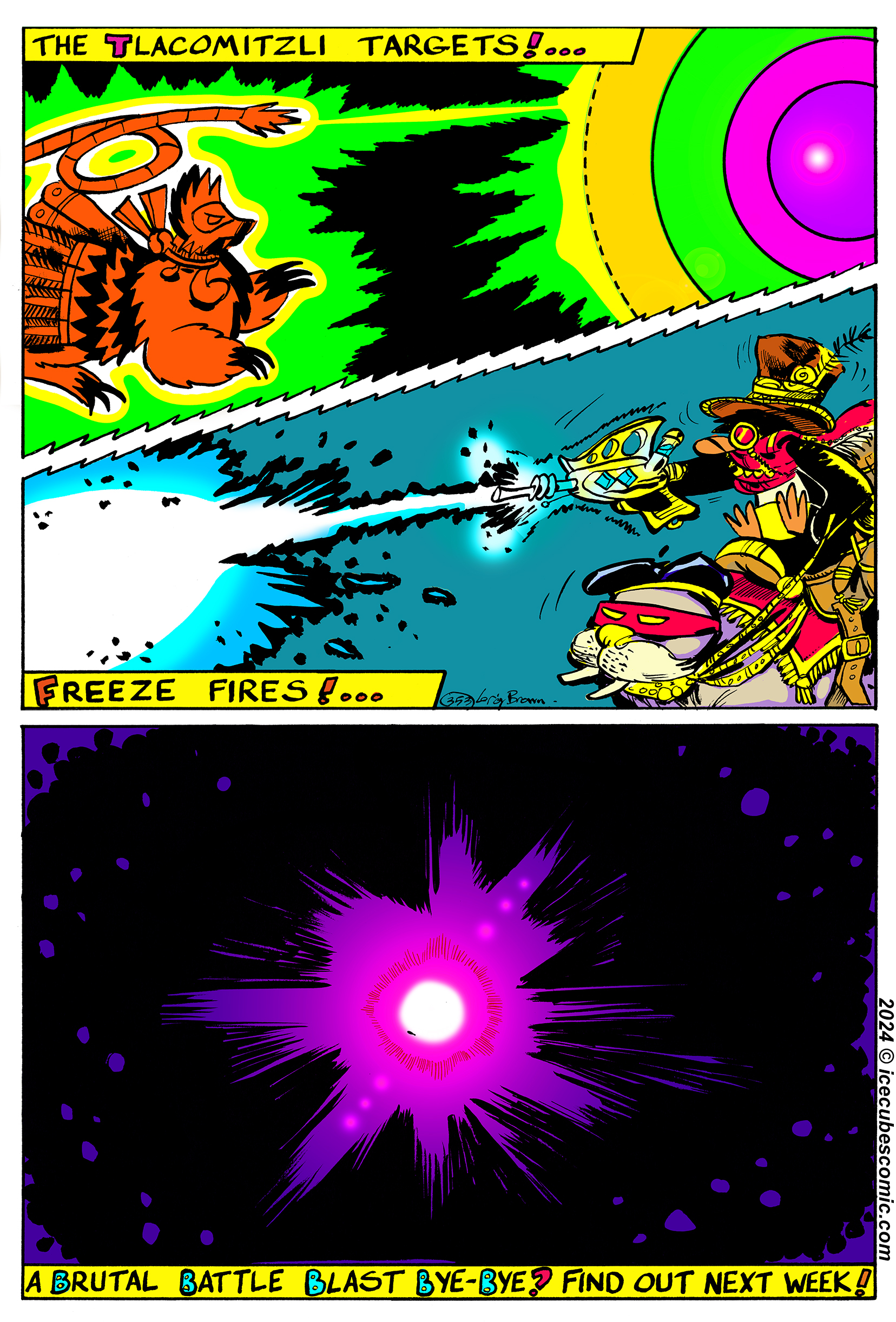
ICECUBES the comic strip #353
69 27436 Mar 29, 2024
Search by Character:
Boo-Boo Boomer Bear Buckaroo Bonanza Eggman Felix Freeze Kiviuk Mickey Nooky Peckinpaw Percy Popeye Susie Taco Tlaco MitzliChoose your chapter to start reading:
ICEBOX Blog Tags:
Comics Tags:
Animated Anime Books Cartoons Christmas Classic Comic Strips Easter Eggman Felix Freeze Halloween Happy New Year! ICECUBES Japan Kawaii Manga Marvel Mickey Mouse Movies Nooky Original art Peckinpaw Percy Pogo Spiderman Subscribers Summer Taco ThanksgivingRecent Comments
Categories
Alaska time
Archives
Search ICECUBES
Online Fans
No one is online right now