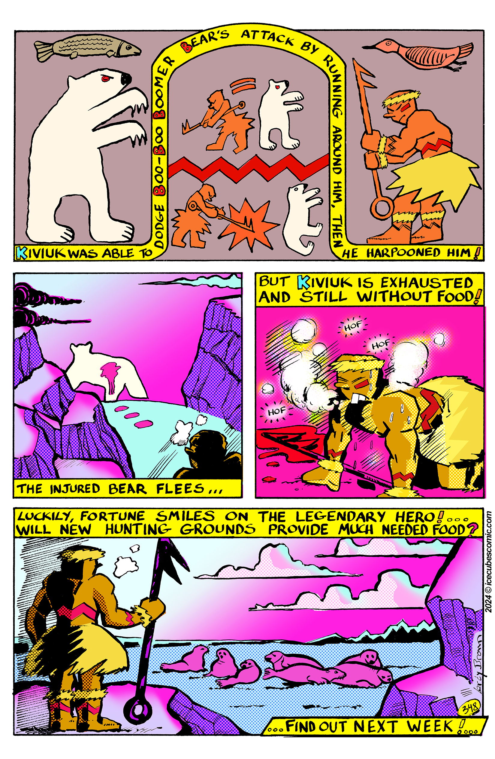
Wow, page 3 of Freeze's big movie! This one was more challenging for me because I got behind schedule and had to double down to finish it. I hope you like this series. It certainly is a new look! Remember: Support ICECUBES and click on the ads!
coming soon!ICECUBES the comic strip Volume 2 on the Kindle is coming out real soon! Watch for the announcement on Facebook and Twitter! Get it first and show off to your friends! More than 60 pages of comics and art from your pals at ICECUBES.
This will be the one everyone will want, so be on the lookout for ICECUBES the comic strip Volume 2 !
It used to be that comics had really great colors. Big primary colors printed with halftone dots. A lot of the times the color dots were off register and would bleed outside the lines. That was so cool! In fact my wife and I agree that it made the comic better when the color was off register like that!
Nowadays I’ve noticed that colors are no longer printed that way. In fact colors lay real flat on the page now and seem to look dull in some cases. For instance this Peanuts Sunday cartoon just looks flat and lifeless.The colors are drab and dull. Its quite upsetting actually to see a once great comic strip like Peanuts reduced to looking second rate. Whoever colored this did an awful job. But that’s not the only problem. The colors are extremely flat and are perfectly within the lines, how deadening is that? Sometimes too much technology just kills something great.
I did find something cool though. It seems that McDonalds still uses the old halftone print jobs on their Happy Meal bags! I think they look great by the way and so much more dynamic than that poor Peanuts strip. Good job McDonalds, I hope they keep it up! I would love to print an ICECUBES comic book this way! 🙂


4 thoughts on “ICECUBES the comic strip #348”
Anna Banana
I cannot wait. The top panel is very different but it works!
Leroy Brown
Thank you! I drew the first panel as a tribute to traditional Innupiaq art. 🙂
Jehsong Baak
Leroy, your comic strip is awesome. I don’t understand why ICECUBES isn’t a household name… All the best from Paris.
Leroy Brown
Thank you for the encouragement! My best to you.
Still Sleeping…
Santa Says:
Winter Is Here! :)
ICECUBES Kindle Volume 2 Cover!
The Cover.
Ice Bag.
Pencil sketches.
Kindle Volume #2 Cover Art.
ICECUBES the comic strip. Kindle Vol. 2!
Color matters! Peanuts vs. McDonalds.
Icesticks.
Icesticks.
New ICECUBES Book Vol. 3!
New ICECUBES T-Shirt! *** 12 awesome colors!
Latest ICECUBES Comics!
ICECUBES the comic strip #370
63 35689 May 13, 2026
ICECUBES the Comic Strip #369
27 9077 Apr 09, 2026
ICECUBES Vol.3 “The Stuff of Dreams!” Now Available!
211 36280 Dec 13, 2025
ICECUBES the Comic Strip #368
59 31159 Nov 03, 2025
ICECUBES in Japanese!
29 35786 Oct 06, 2025
ICECUBES the Comic Strip #367
50 36362 Sep 07, 2025
ICECUBES the Comic Strip #366
20 27743 Aug 14, 2025
ICECUBES the Comic Strip #365
15 17137 Jul 31, 2025
ICECUBES the Comic Strip #364
13 15598 Jul 18, 2025
ICECUBES the Comic Strip #362
13 13535 Jul 11, 2025
ICECUBES vol.2 comic book now available as a digital download for only $1.99! Click on the picture!
Books
Click here to get all the great classic ICECUBES comic strips and exclusive behind the scenes blog posts!
Top Ten ICECUBES comics!
ICECUBES the comic strip #359
102 89025 Jul 05, 2024
ICECUBES the Comic Strip #363
99 69515 Apr 24, 2025
ICECUBES the comic strip #360
85 55566 Oct 18, 2024
Sad…
63 39631 Feb 12, 2025
ICECUBES the comic strip #0236 Animated!
88 37979 Mar 10, 2014
ICECUBES the Comic Strip #367
50 36362 Sep 07, 2025
ICECUBES Vol.3 “The Stuff of Dreams!” Now Available!
211 36280 Dec 13, 2025
ICECUBES in Japanese!
29 35786 Oct 06, 2025
ICECUBES the comic strip #370
63 35689 May 13, 2026
ICECUBES the comic strip #353
72 31418 Mar 29, 2024
Search by Character:
Boo-Boo Boomer Bear Buckaroo Bonanza Eggman Felix Freeze Kiviuk Mickey Nooky Peckinpaw Percy Popeye Susie Taco Tlaco MitzliChoose your chapter to start reading:
ICEBOX Blog Tags:
Comics Tags:
Animated Anime Books Cartoons Christmas Classic Comic Strips Easter Eggman Felix Freeze Halloween Happy New Year! ICECUBES Japan Kawaii Manga Marvel Mickey Mouse Movies Nooky Original art Peckinpaw Percy Pogo Spiderman Subscribers Summer Taco ThanksgivingRecent Comments
Categories
Alaska time
Archives
Search ICECUBES
Online Fans
No one is online right now