

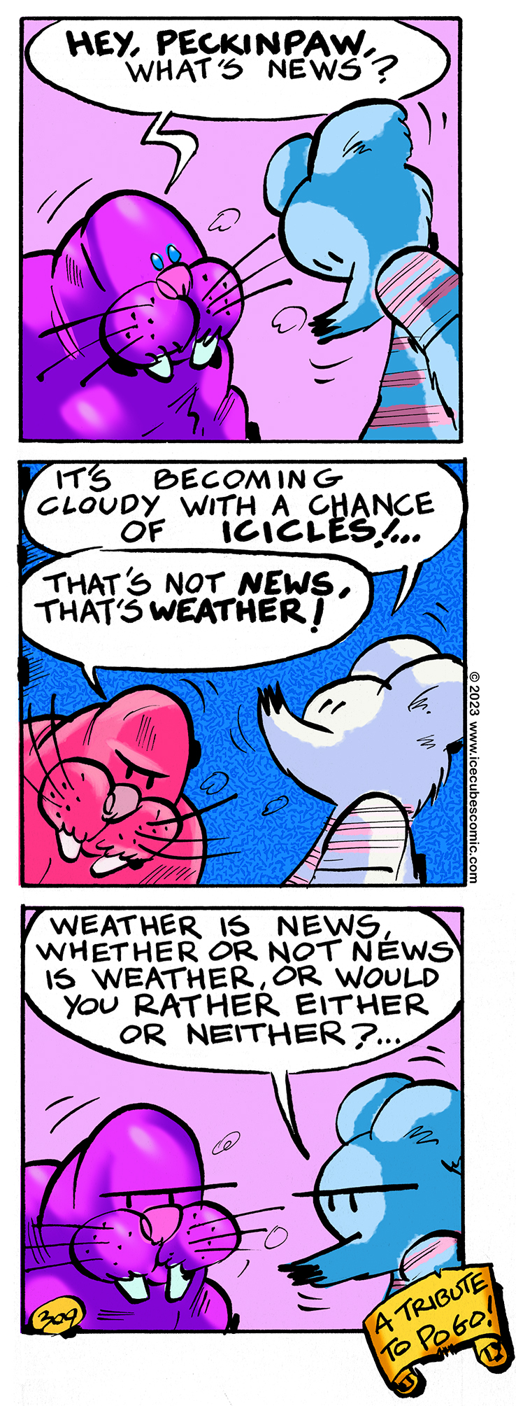
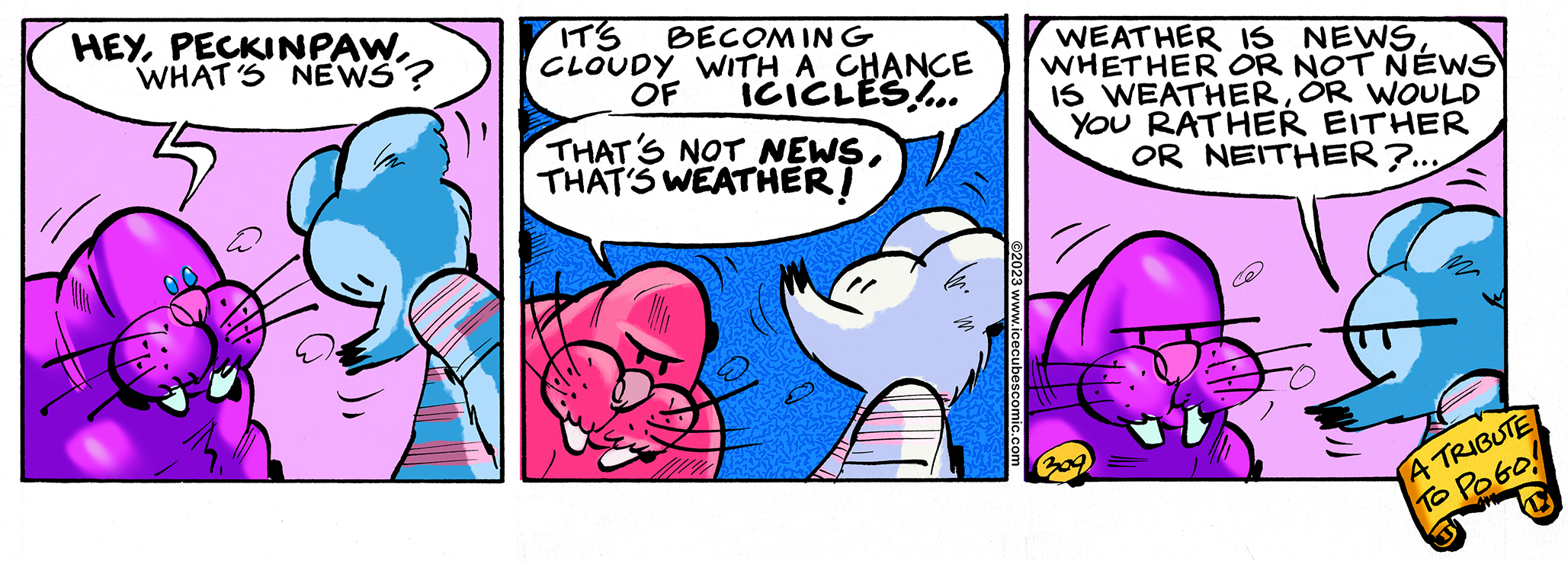
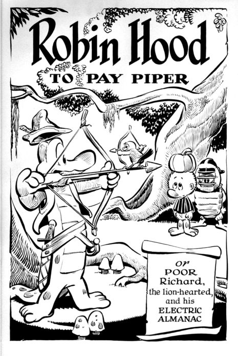
Pogo was a comic strip that I remember seeing in the papers a long time ago. Although I couldn't really understand what it was all about, I really enjoyed the drawings. Did you know that Walt Kelly worked for Disney before starting Pogo? That probably explains why his drawings are so good. The reason Pogo was confusing for a little kid was that the words were always so complicated. It was clearly directed at an adult audience (the kind that read newspapers obviously) and not kids. I learned to better appreciate it later on in life and still love the drawings.
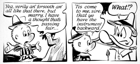
Pogo the comic strip
Today's ICECUBES comic strip is a tribute to those Pogo style tongue twisters and so now you know.
Please click on the ads. Every click counts!
2 thoughts on “ICECUBES the comic strip #309”
Luc Delahoussaye
Great strip!!! but where is Nooky I haven’t seen him in a while
Leroy Brown
I wouldn’t be surprised if he showed up soon. Thanks for stopping by!
Still Sleeping…
Still Sleeping…
Still Sleeping…
Santa Says:
Winter Is Here! :)
ICECUBES Kindle Volume 2 Cover!
The Cover.
Ice Bag.
Pencil sketches.
Kindle Volume #2 Cover Art.
ICECUBES the comic strip. Kindle Vol. 2!
Color matters! Peanuts vs. McDonalds.
New ICECUBES Book Vol. 3!
New ICECUBES T-Shirt! *** 12 awesome colors!
ICECUBES vol.2 comic book now available as a digital download for only $1.99! Click on the picture!
Latest ICECUBES Comics!
ICECUBES the comic strip #370
113 65939 May 13, 2026
ICECUBES the Comic Strip #369
27 9926 Apr 09, 2026
ICECUBES Vol.3 “The Stuff of Dreams!” Now Available!
211 37167 Dec 13, 2025
ICECUBES the Comic Strip #368
61 32249 Nov 03, 2025
ICECUBES in Japanese!
29 37668 Oct 06, 2025
ICECUBES the Comic Strip #367
51 37243 Sep 07, 2025
ICECUBES the Comic Strip #366
21 28196 Aug 14, 2025
ICECUBES the Comic Strip #365
15 17584 Jul 31, 2025
ICECUBES the Comic Strip #364
13 16289 Jul 18, 2025
ICECUBES the Comic Strip #362
15 14842 Jul 11, 2025
Explore More Pages!
Choose your chapter to start reading:
Top Ten ICECUBES comics!
ICECUBES the comic strip #359
102 89855 Jul 05, 2024
ICECUBES the Comic Strip #363
99 69997 Apr 24, 2025
ICECUBES the comic strip #370
113 65939 May 13, 2026
ICECUBES the comic strip #360
85 56159 Oct 18, 2024
ICECUBES the comic strip #0236 Animated!
88 43506 Mar 10, 2014
Sad…
66 40728 Feb 12, 2025
ICECUBES in Japanese!
29 37668 Oct 06, 2025
ICECUBES the Comic Strip #367
51 37243 Sep 07, 2025
ICECUBES Vol.3 “The Stuff of Dreams!” Now Available!
211 37167 Dec 13, 2025
ICECUBES the comic strip #353
72 33797 Mar 29, 2024
Search by Character:
Boo-Boo Boomer Bear Buckaroo Bonanza Eggman Felix Freeze Kiviuk Mickey Nooky Peckinpaw Percy Popeye Susie Taco Tlaco MitzliICEBOX Blog Tags:
Comics Tags:
Animated Anime Books Cartoons Christmas Classic Comic Strips Easter Eggman Felix Freeze Halloween Happy New Year! ICECUBES Japan Kawaii Manga Marvel Mickey Mouse Movies Nooky Original art Peckinpaw Percy Pogo Spiderman Subscribers Summer Taco ThanksgivingRecent Comments
Categories
Alaska time
Archives
Search ICECUBES