ICECUBES the comic strip #303

ICECUBES the comic strip #303

1 7353

ICECUBES the comic strip #303

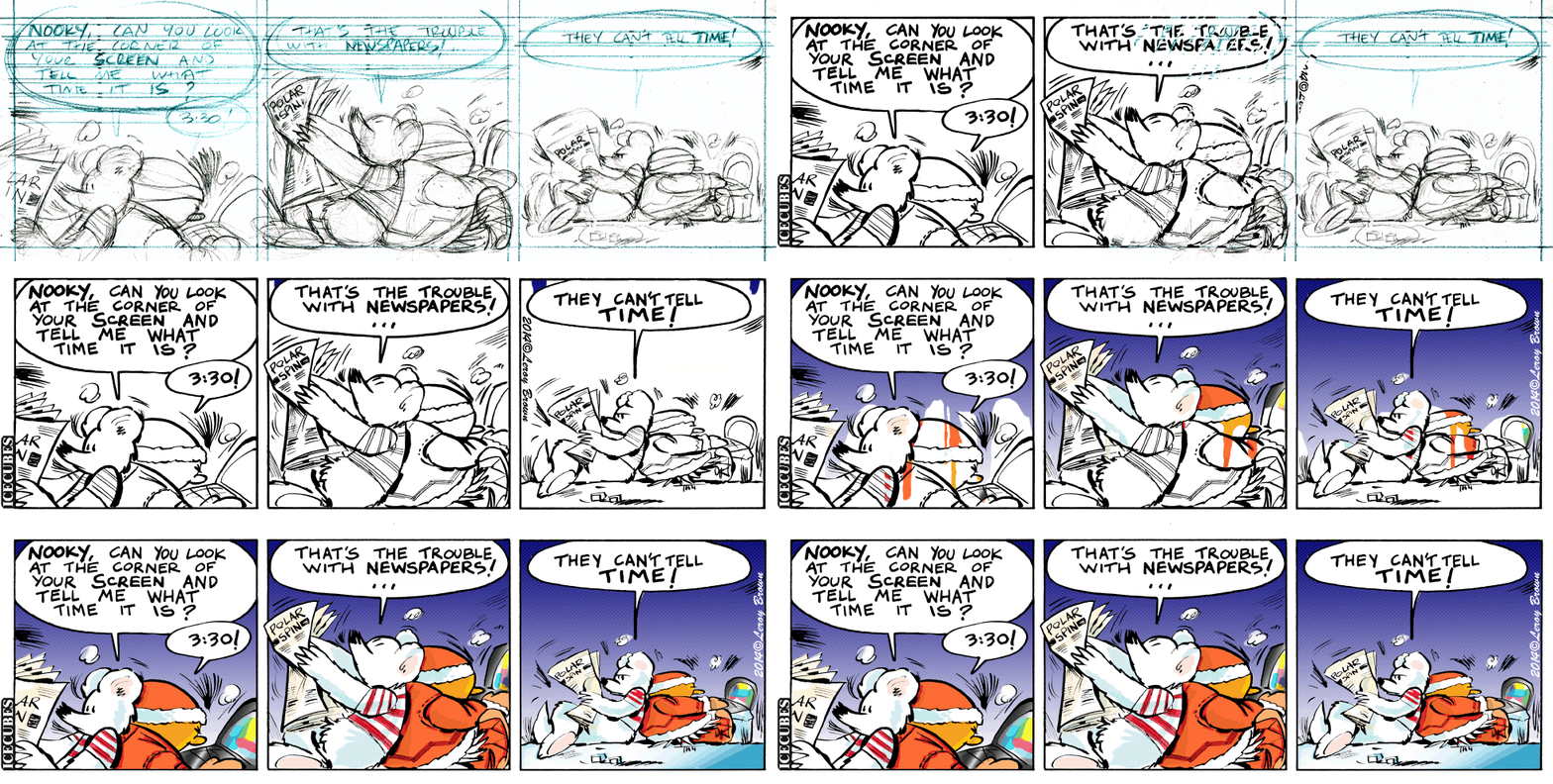
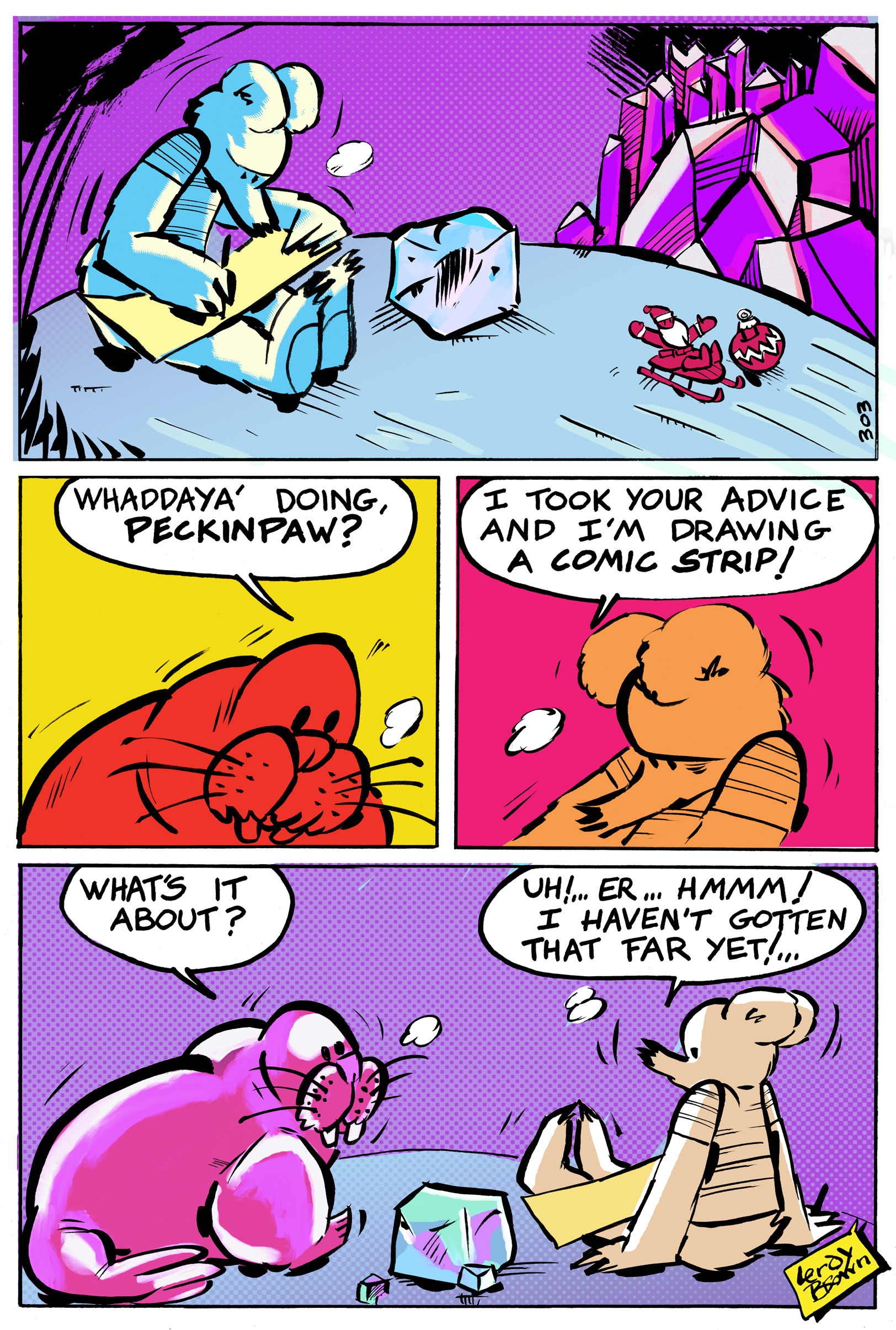
Hmm, what's going on here? Has Peckinpaw decided to draw a strip of his own? I have no idea what's on his mind. I guess we'll have to see how this strange turn develops.


I just want to take a minute to thank all you ICECUBES fans for still tuning in after a rather longish hiatus. Hopefully, this is the beginning of a new chapter in the adventures of Peckinpaw, Freeze, Eggman, Nooky and the others. For this to work I have made some changes to the format of the strip. Since you are probably watching on a phone, ICECUBES is now in beautiful Vertical Vision©! The website is undergoing some radical changes too. I hope you will like the new experience and if you do, please consider supporting the strip. You can do so by simply clicking on the ads you see on the website. That really helps! Leroy Brown

One thought on “ICECUBES the comic strip #303”

  1. Thanks for reading ICECUBES the comic strip! I hope you enjoy the new format. Let me know how it reads on your device. I try real hard to keep the ads PC friendly so let me know if anything is jarring. Please click on the ads if you can or become a subscriber for only $1.

Leave a Reply

Your email address will not be published. Required fields are marked *

*

This site uses Akismet to reduce spam. Learn how your comment data is processed.

Color matters! Peanuts vs. McDonalds.

comparison It used to be that comics had really great colors. Big primary colors printed with halftone dots. A lot of the times the color dots were off register and would bleed outside the lines. That was so cool! In fact my wife and I agree that it made the comic better when the color was off register like that! Nowadays I’ve noticed that colors are no longer printed that way. In fact colors lay real flat on the page now and seem to look dull in some cases. For instance this Peanuts Sunday cartoon just looks flat and lifeless.© Universal Press The colors are drab and dull. Its quite upsetting actually to see a once great comic strip like Peanuts reduced to looking second rate. Whoever colored this did an awful job. But that’s not the only problem. The colors are extremely flat and are perfectly within the lines, how deadening is that? Sometimes too much technology just kills something great. I did find something cool though. It seems that McDonalds still uses the old halftone print jobs on their Happy Meal bags! I think they look great by the way and so much more dynamic than that poor Peanuts strip. Good job McDonalds, I hope they keep it up! © Mc Donalds I would love to print an ICECUBES comic book this way! 🙂 © Mc Donalds