


 I’m putting the finishing touches on the cover. The countdown is on! Be sure to catch ICECUBES the comic strip Volume 2 as soon as it comes out!!
 see the published strip here

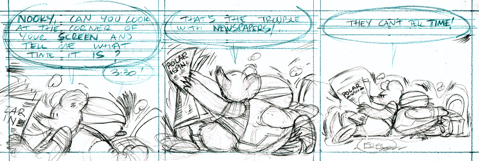
 Preliminary pencil sketch for the cover of Vol. 2 on the Kindle. It’s coming real soon! 🙂
 It used to be that comics had really great colors. Big primary colors printed with halftone dots. A lot of the times the color dots were off register and would bleed outside the lines. That was so cool! In fact my wife and I agree that it made the comic better when the color was off register like that!
Nowadays I’ve noticed that colors are no longer printed that way. In fact colors lay real flat on the page now and seem to look dull in some cases. For instance this Peanuts Sunday cartoon just looks flat and lifeless.
It used to be that comics had really great colors. Big primary colors printed with halftone dots. A lot of the times the color dots were off register and would bleed outside the lines. That was so cool! In fact my wife and I agree that it made the comic better when the color was off register like that!
Nowadays I’ve noticed that colors are no longer printed that way. In fact colors lay real flat on the page now and seem to look dull in some cases. For instance this Peanuts Sunday cartoon just looks flat and lifeless. The colors are drab and dull. Its quite upsetting actually to see a once great comic strip like Peanuts reduced to looking second rate. Whoever colored this did an awful job. But that’s not the only problem. The colors are extremely flat and are perfectly within the lines, how deadening is that? Sometimes too much technology just kills something great.
I did find something cool though. It seems that McDonalds still uses the old halftone print jobs on their Happy Meal bags! I think they look great by the way and so much more dynamic than that poor Peanuts strip. Good job McDonalds, I hope they keep it up!
The colors are drab and dull. Its quite upsetting actually to see a once great comic strip like Peanuts reduced to looking second rate. Whoever colored this did an awful job. But that’s not the only problem. The colors are extremely flat and are perfectly within the lines, how deadening is that? Sometimes too much technology just kills something great.
I did find something cool though. It seems that McDonalds still uses the old halftone print jobs on their Happy Meal bags! I think they look great by the way and so much more dynamic than that poor Peanuts strip. Good job McDonalds, I hope they keep it up!  I would love to print an ICECUBES comic book this way! 🙂

 Funny Mexican Popsicle wrapper. Funny Mexican Popsicle wrapper. Funny Mexican Popsicle wrapper.
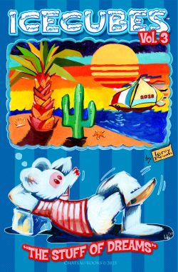
ICECUBES Vol.3 “The Stuff of Dreams!” Now Available!
10 1829 Dec 13, 2025

ICECUBES the Comic Strip #368
48 27153 Nov 03, 2025
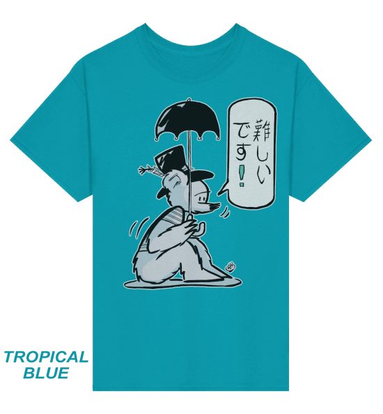
ICECUBES in Japanese!
22 29625 Oct 06, 2025

ICECUBES the Comic Strip #367
42 32267 Sep 07, 2025

ICECUBES the Comic Strip #366
12 25581 Aug 14, 2025

ICECUBES the Comic Strip #365
4 15047 Jul 31, 2025

ICECUBES the Comic Strip #364
8 13045 Jul 18, 2025

ICECUBES the Comic Strip #362
7 9348 Jul 11, 2025

ICECUBES the Comic Strip #363
79 67530 Apr 24, 2025

Sad…
50 35370 Feb 12, 2025


ICECUBES the comic strip #359
97 85939 Jul 05, 2024
ICECUBES the Comic Strip #363
79 67530 Apr 24, 2025

ICECUBES the comic strip #360
81 52885 Oct 18, 2024
Sad…
50 35370 Feb 12, 2025
ICECUBES the Comic Strip #367
42 32267 Sep 07, 2025
ICECUBES in Japanese!
22 29625 Oct 06, 2025
ICECUBES the Comic Strip #368
48 27153 Nov 03, 2025
ICECUBES the comic strip #0236 Animated!
75 26893 Mar 10, 2014
ICECUBES the Comic Strip #366
12 25581 Aug 14, 2025
ICECUBES the comic strip #353
68 25520 Mar 29, 2024